Claude launch film, broken down
How a 91-second product film is built: four cuts, a 110 BPM grid under every move, and sound you can point at.
- Context
- Study of Anthropic’s launch film
- Contribution
- Shot-by-shot analysis, sound analysis, and the breakdown tooling
- Period
- November 2026
- Explore
- Watch the original on X ↗
The project
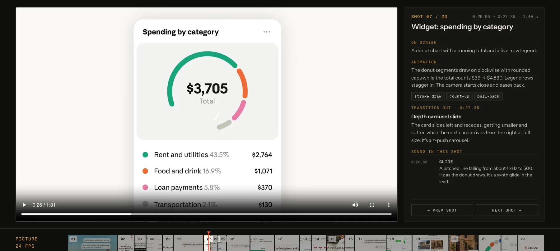
Anthropic launched Personal Finance in Claude with a 91-second film that is almost all interface: a family planning a week in Rome, told through chat bubbles, widgets and three photographs. I broke it down shot by shot to learn how it was made. I logged 23 shots, named each animation style and transition, and timed 36 sounds against the picture from the audio itself. The result is an interactive page where the film drives a playhead across picture, motion, cut and sound lanes, plus a quote-post cut that runs the analysis live around the film. The film is Anthropic’s. This is an unofficial study, not made for or endorsed by Anthropic.
Four cuts in 91 seconds.
Scene detection finds only four picture cuts: into the UI at 9.5 seconds, out to live gelato footage and back, and into the end line. Everything else is a move inside the interface. The chat scrolls up like a real conversation, widgets pass on a carousel with depth, words erase in reading order and become the next bubble, and a hotel thumbnail grows to fill the frame. Even the end mark comes from the product: the last orange thinking dot blooms into the Claude spark and the wordmark types out from behind it.
The edit sits on the music.
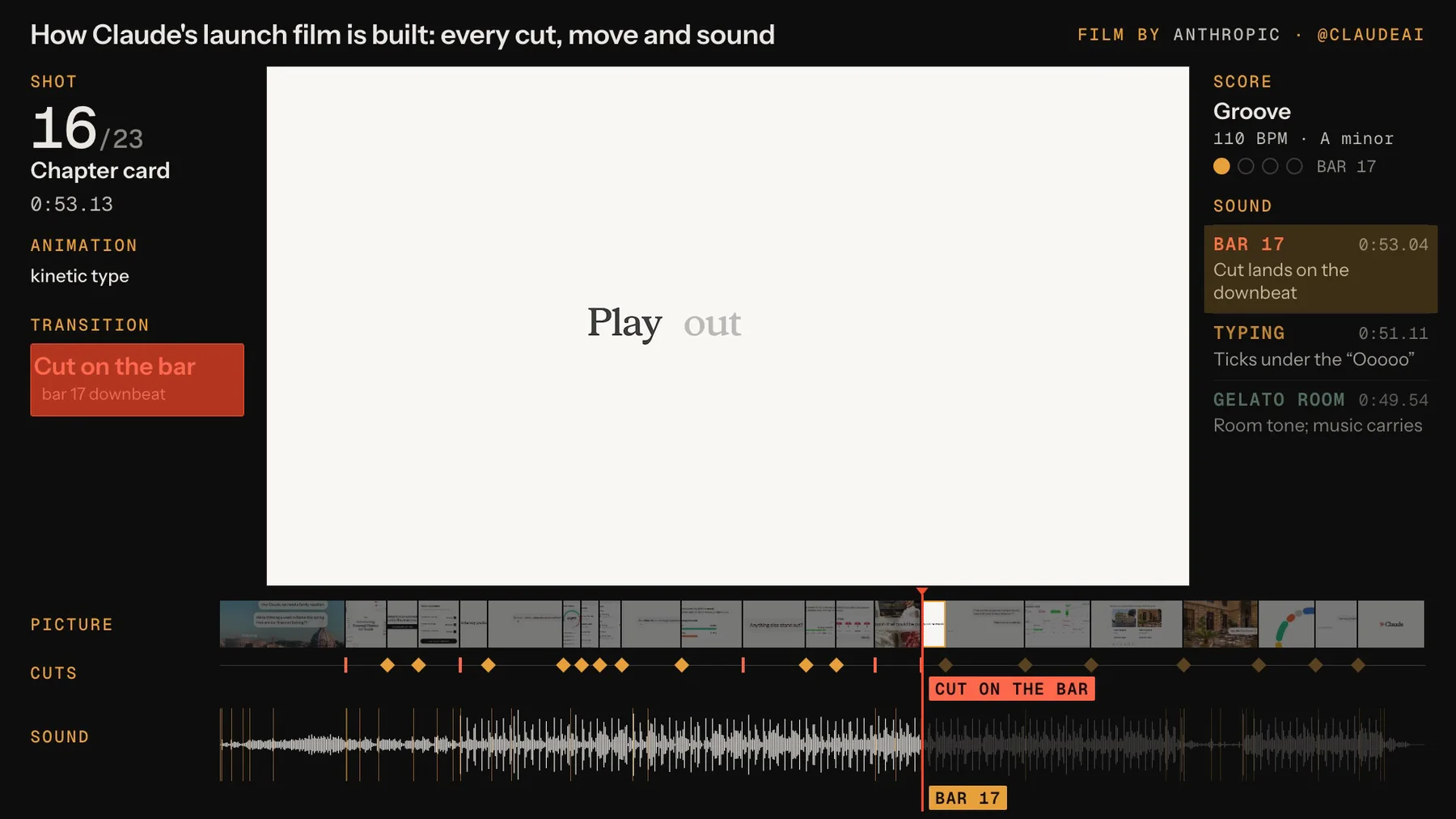
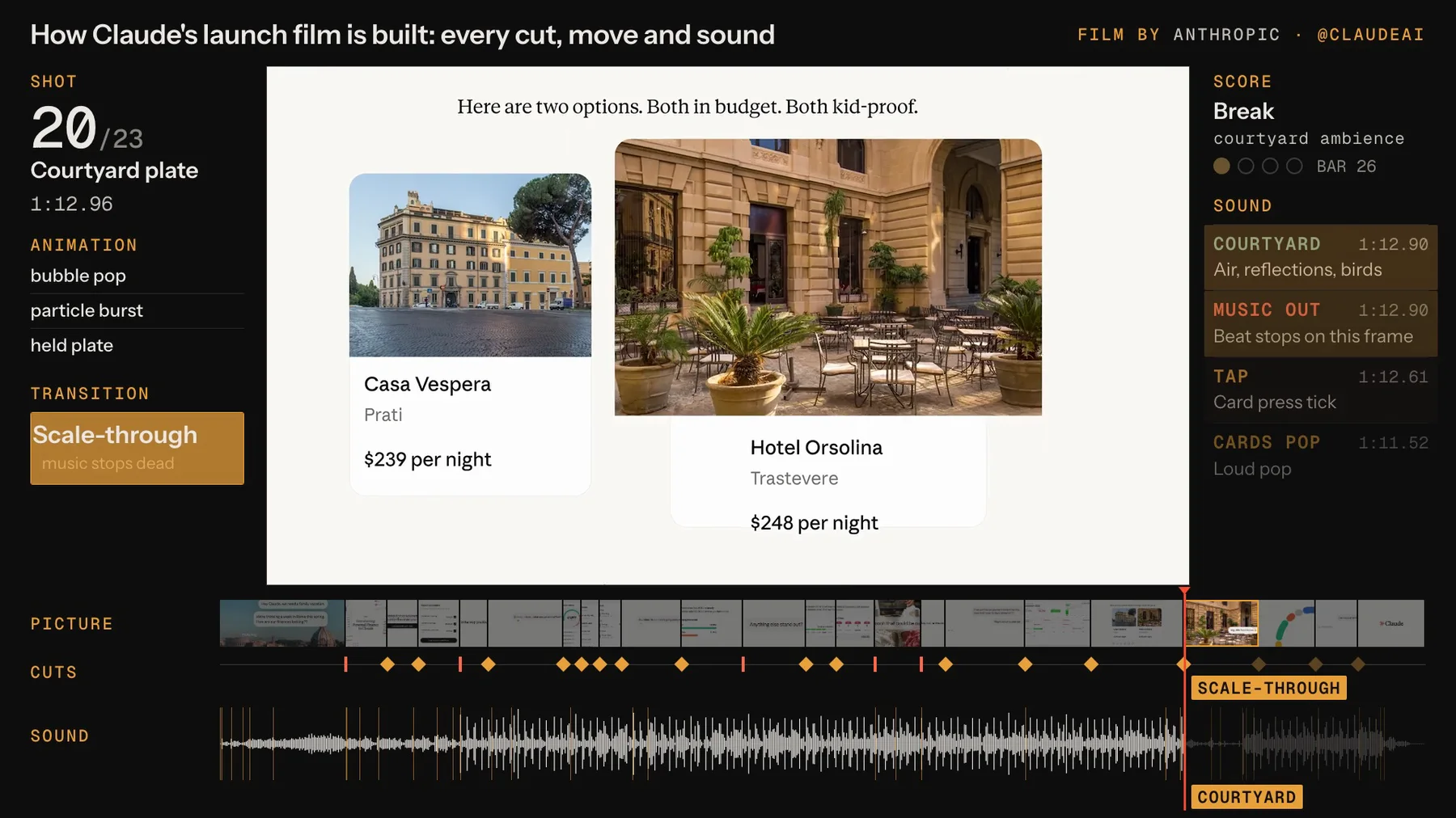
The score runs at 110 BPM in A minor, and the big moments are cut to it. The first hard cut lands exactly 16 beats before the drums come in. The drop falls on the frame of the first type card, so the picture change and the beat are one event. At 72.9 seconds the music stops on the same frame the hotel photo fills the screen, and courtyard air and distant birds carry the moment. When the groove returns 8 beats later it is still on the original grid, so the pause reads as intentional rather than as a gap.
Sound you can point at.
There is no voice-over; the chat copy tells the story. The interface sounds are small and placed with care. Typing ticks sit 40 to 60 milliseconds off the beat grid, so they read as keys rather than hi-hats. The three checkboxes are soft, low taps around 500 Hz, closer to felt or wood than plastic. Every sound here is timed from audio onsets and a beat-grid fit rather than by ear. The material names are my reading of the spectrum, because only the final stereo mix exists.
A small, strict design system.
Every UI shot sits on one warm paper ground. The user speaks in a clean sans inside grey bubbles, and Claude answers in a serif. Each new word of Claude’s replies arrives in the brand orange and cools to ink, which makes the text feel written rather than pasted. Real-world photographs of Rome, gelato and the courtyard interrupt the interface roughly every 25 seconds to reset the eye. Each holds a feeling, not a feature.
Built as tools, not slides.
The study is code from end to end. A script pulls the film, contact sheets at 2 and 8 frames per second, scene detection and an audio analysis of onsets, spectrograms and a beat grid. One data file then feeds a beat map, an interactive breakdown page and a static timeline. The quote-post cut is an HTML scene driven by a single clock. It is rendered frame by frame and composited over the film with its original audio.
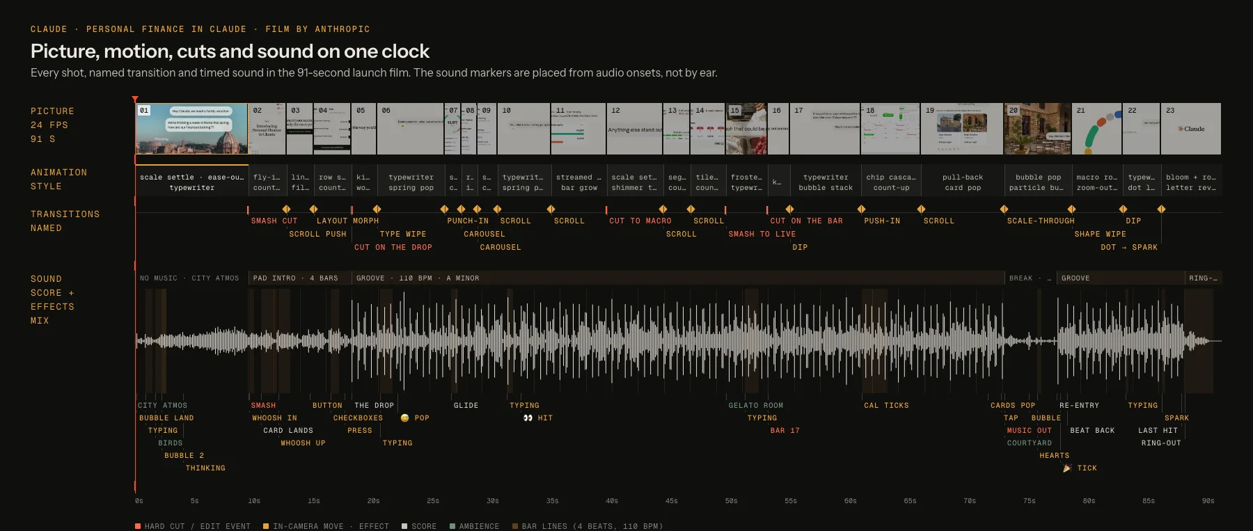
Picture, motion, cuts and sound on one clock.
Every shot, named transition and timed sound in the film, with the waveform underneath. Red marks are hard cuts and amber diamonds are moves inside the interface.
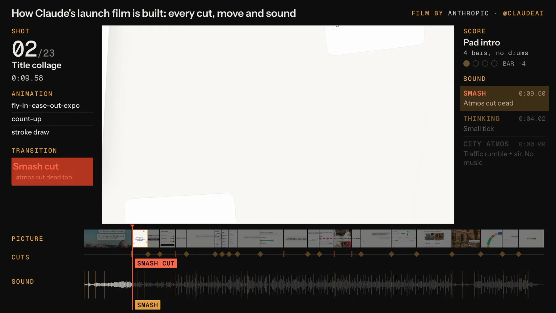
The analysis running live.
Frames from the quote-post cut, where the notes appear on the same clock as the film: the shot and transition on the left, the score and sounds on the right.
The interactive breakdown.
The film drives the page. Each shot’s notes follow the playhead, and clicking any marker jumps the film to that cut or sound.